

seagoal
-
Posts
3,985 -
Joined
-
Last visited
-
Days Won
136
Content Type
Profiles
Forums
Store
Gallery
Blogs
Events
Downloads
Everything posted by seagoal
-
Pretty sure that's a No. The VE8 graphic does not seem to be transferable at all to the public right now. You could just give them a call and ask.
-
Yes, it is the same basic concept. Heat up the thing until the thing conforms to your shape and softens so it breaks in quick. It's what Vaughn calls Heat Moldable. You can use this method instead of using hot water, for example.
-
180 degrees for 6-7 minutes are the specs from Vaughn. Keep the backhand open and loose. Once done put your hand in and strap it tight how you'd want it in a game. My glove was perfectly game ready after.
-
Wow, they look so good with those pads. So awesome you got two free sticks. Great move on their part. I fully understand about the blocker. The first time I put my hand in my new VE8 blocker i was quite amazed at how comfortable it was. The pad on top of the backhand is so good and keeps the blocker really snug and stiff feeling, which i really enjoy. Rebounds come off it really hot. Are you going to bake the glove?
-
You guys have captured the PNW well. Nice work.
-
That's a good illustration of types of green. I think the middle one is too similar to Minnesota but the bottom one is just about right. Not too similar to Dallas and more of a Seattle emerald green. It'd be cool to see that slate blue one with neon green instead of red.
-
Loved those jerseys. I think green is a guarantee at this point.
-
Actually, I was thinking of these guys but the one you sent is even better. The Blacktron crew was just beyond my time playing with Legos. Nice catch!

-
Holy crap that goalie looks so badass. Wow. Love it. Great use of "Seahawks/Sounders green" as an accent. Anyone in their 30s remember the neon green accented Lego vehicles with the magnets*? He reminds me of those guys. We could change the black to dark navy blue? *No Vaughn jokes, please
-
Haha. One of my favorite masks ever.

-
We badly need those 3 sheets in the training facility, too. We have 9 rinks in the metro area and they're all saturated, fully booked. There's zero room for growth right now.
-
I'll take Burns in a heartbeat! Brilliant marketing, he is a really good looking hockey player, too. Seattle is a very tattooed city. He would be a star here.
-
I just saw this @stackem30 after my response. We've echoed pretty well. Cheers.
-
That's fair. I'm not saying it's my concern or red flag, personally. I just think in business you have to be smart about branding and with sports, especially, given the nature of how names and logos are utilized and adopted. In principle, if your choice is Neutral vs. Contentious (even to some), Neutral is a better choice, in principle. That said, I'm an advocate for free markets and lack of censorship, but I think taking into consideration how your branding negatively affects people in your community is wise. I also think it's wise to not be overly concerned with offending people, which is inevitable no matter what. People in Seattle are already offended by another sports team coming to town when there are homeless people on the streets, despite the fact that the NHL team will be privately funded. Just points to consider.
-
I brought that up too, about Totems. The youth hockey organization here has a long history here and that's fine. But, in 2018, I think taking on a Native American term/image as a sports name/logo is potentially very problematic. It doesn't offend me, personally, but I find it a bit tacky and it opens up a whole host of problems that are way too easily avoidable.
-
Local fan concepts


-
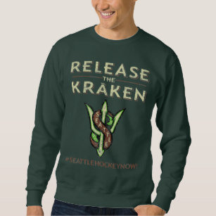
I'd say Kraken is the #2 most popular in town, with the tagline Release the Kraken!!
-
That's been discussed. We would be in the clear. It's not like how Seattle Orca would be with Vancouver since they officially use an Orca for branding. I don't think the Red Wings have any legal claim to an octopus.
-
Ha, that's funny. And all to familiar for Seattle. Much more so in Portland, for sure. There's been a lot of talk around town and various polls and contests for names, as you can imagine. The top name in many of these was Totems, which is the longtime name of a junior hockey program here. Other top names are Sockeyes, Metropolitans, and Kraken. Pilots has had some traction. I'm personally really hoping for an S name. Minus the Mariners, all pro sports teams here start with S. Kraken has awesome logo and mascot potential. but they'd inevitably be called the Krack, which wouldn't be flattering. Facetious names around town are Soy Lattes, Grinders, Liberals, Techies, and Ships. I'm more picky about colors than names, but I do like Sockeyes and Kraken.
-
Those Seals uniforms just scream Seattle to me. Those are great colors. I forgot about them, well played
-
We shall see. I thought it was great that the Canucks owner has been so openly supportive and acknowledged the geographic rivalry potential. I'm sure the Canucks would love a road trip on a bus now and then. Seattle is so close.
-
That's a common theme around the hockey community here. I just wonder how bright lime neon green would look in hockey. It seems so.....flashy.
-
Very nice Mike
-
Ha, sorry mate. That wisdom took a while to simmer.
-
What do you all think should be the colors for the upcoming NHL team in Seattle? It is pretty much locked in at this point. Season ticket deposits are sold out, the city approved the arena upgrades, the NHL Executive Committee voted for approval, and the ownership group announced the training facility, seen here https://www.nhlseattle.com/ Pretty excited about that announcement. That facility is a 25 minute walk from my house and we badly need more rinks in the area. These would be the first in Seattle proper. However, there has been no official talk of the team name or colors. Names aside, what colors should the team use? What colors are needed or underused in the league? I think the most underused colors are purple and green. Of those, green is very Seattle, nicknamed the Emerald City. This city is constantly green due to the rain. We have the Sounders and Seahawks who both use (neon) green and Mariners who use teal, granted it is more blue than green real. And of course the former Sonics, who's primary color was green. Oh yeah, and the Stanley Cup champion Metropolitans used green, as well. So, I think green is an inevitable choice. I saw this goalie from UA Anchorage and I thought: that's it. Not only does it look Seattle and it would be a nice tip of the hat to the Sonics fans, it is a color scheme not used in the NHL and would be a great way to represent the city and stand out in the league. Thoughts? What do you all think about colors for NHL Seattle? I also really like the colors salmon orange, battleship grey, and white. But that's behind green, sport gold, and white.


