coopaloop1234
-
Posts
7,442 -
Joined
-
Last visited
-
Days Won
391
Content Type
Profiles
Forums
Store
Gallery
Blogs
Events
Downloads
Everything posted by coopaloop1234
-
Don't say that. Just say that we are your one and only.
-
I think a better start is to find out how most people find content on this site and their general browsing habits. I rarely, if ever, use the general forum tabs. I pretty much use "unread" and "latest" and I'm able to find all new posts/threads and anything else I've missed.
-
 I didn't have enough padskiz. Haha
 -
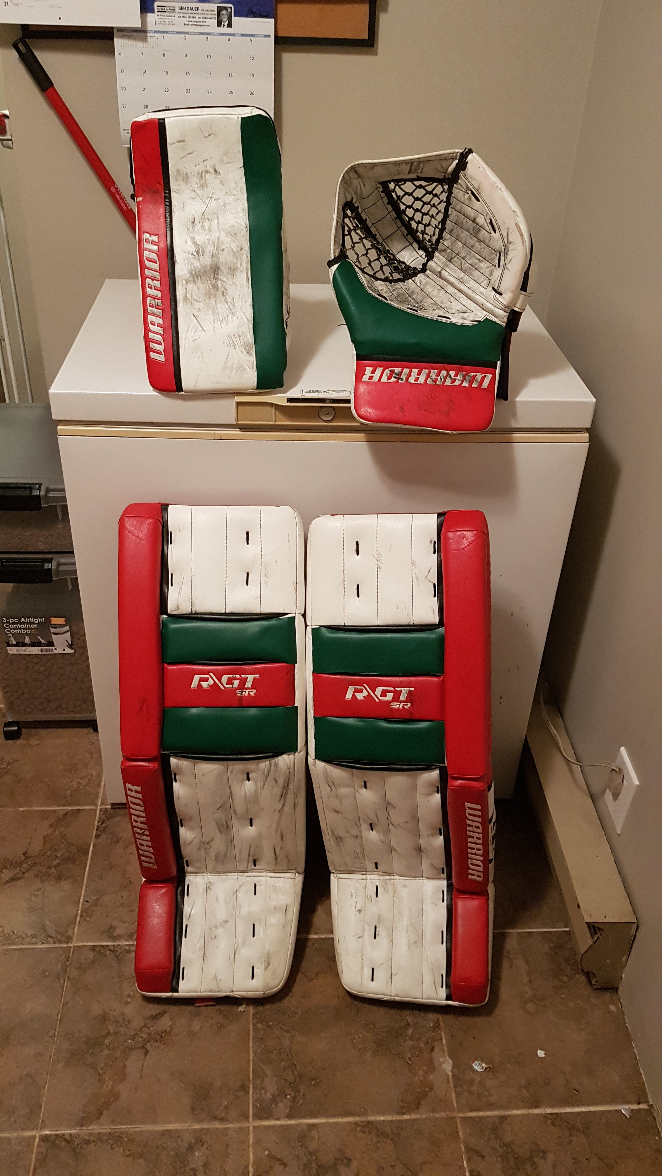
Decided to use up some left over padskins to spruce up the gear for the holidays.

-
They're not. It's an adjustment strap for the knee lock or knee to calf lock. CRS Strap is a different purpose.
-
Think of it as a locking mechanism. Because Warrior pads use a neoprene strap, there isn't a lot of resistance behind it. The nylon strap acts as a final barrier to keep your leg/knee in place.
-
Yea, meant to elaborate that in my post but didn't for whatever reason. The SR level G3 and GT's all came with the straps, SR G4's didn't. I also know what they stated their rational was, I just found it really poor. It's a low cost item that has been found in both previous SR lines but they removed it because "People didn't see the added benefit, oh, but we kept it on our Pro line because they saw the benefit." That rationale doesn't make too much sense to me.
-
GT's always did, they got rid of those offerings on the G4's for whatever reason.
-
I'm assuming he meant wouldn't. Just off of the images, it looks almost identical to the R/GT.
-
The laces on the face of the glove makes me think it's the R/GT 2. Plus the graphic matches too.
-
Yessss. Aside from the split T in the catcher, doesn't look too different than the G4. It will probably keep the same spec changes of the G3->G4. (Hypercomp, Active drop) Doesn't look like the outer roll has been reduced and can't tell if they've carried over the airslide tech.
-
Rink 1 is the best.
-
Looking good bud. You need a small splash of yellow on that gear.
-
Great pictures as always @SaveByRichter35 I'm sure most of us are jealous of the regular shoot time you get.
-
There's plenty of private lessons and lessons during the week. I've been looking for just the weekend courses with no luck so far.
-
So good they'll blow your mind.
-
Not only does the split outer roll bug me, but that colour combination looks rough.
-
It's opposite of the Canucks and while it would be neat, it's just too similar to be rivals. It makes us seem like cousins. Look at all the rest of the grouping of rival teams, they all have pretty distinct colours that differentiate each other. I'm still on board for Vancouver to go back to the Black/Red/Yellow spaghetti skate palette. That way Seattle can have the PNW colours and match with their Seahawks.
-
Yea it's too bad Dallas is almost the same colour. Would've been great for Seattle. Especially using Vancouver's secondary colour as your main? It would be cute seeing you guys trying to fit in.

-
We're bummed about it up here in Vancouver too. We're excited to have our version of the Battle of Alberta / California Gauntlet. We just need a sweet sports name for our teams area.
-
Since it bothers you this much, I'm going to vote that we make sure it stay relevant forever.
-
It's actually my personal cell number.
-
I totally made this save... >_>

-
I take it I don't have a chance eh?
-
Here, now you've seen something even sharper.